
What’s in a Color?
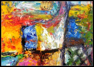
A colorful detail of my painting, Elemental Wisdom.
Those who have seen my work know that one of my signature ingredients is color. But I’ve never attempted to explain the significance of those colors,
until now.
Where did my love of color in my art come from? I think it began as a young teen who was attracted to artists like Marc Chagall, Georgia O’Keefe, Henri Matisse, and Georges Rouault. They used colors liberally to convey mood and emotion in their work.
When I began painting again, I was drawn to color, just as they were, and began to experiment with it and make them my own.
My palette contains a spectrum of colors that I lay out before each painting and refill as needed: Titanium White, Beige, Naple’s Yellow, Yellow Ochre, Cadmium Yellow Light, Cadmium Yellow Medium (lots of yellows!), Cadmium Orange Medium, Cadmium Red Medium, Magenta, Cadmium Green Light, Spruce Green, Phthalo Green, Cobalt Blue, Cerulean Blue, Ultramarine Blue, Purple Dioxine, Burnt Sienna, and Burnt Umber. Lately I I’ve also been putting a few metallics off to the side: gold, silver, and metallic blue.
Do I have favorites? Yes!
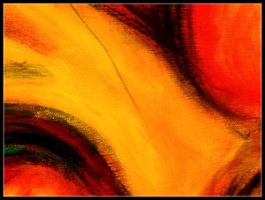
Yellows are one of my favorite colors to work with like this Cadmium Medium Yellow detail from my painting, Ebb and Flow.
Yellows. It’s funny because I neither wear much yellow nor decorate with them, and yet I love to paint with them! My two favorites are Cadmium Yellow Light and Cadmium Yellow Medium.
Cadmium Yellow Light is yellow in it’s pure, untarnished state. It’s the color of the sun. It’s blissful and happy.
Cadmium Yellow Medium is a more sophisticated yellow. It is wise and intelligent. It is also a great color to use as a glaze to brighten other colors.
Blues– Blue is a moody yet harmonizing color. It is space and movement. Perhaps not fast movement, more like a steady momentum through time. It is also a good color to use in the shadows.
A blue I recently discovered is Wedgewood Blue. It’s more of a mysterious, hazy blue and seems very appropriate for my China Paintings, particularly of my Beijing Market Series- with its smoggy beauty. This color juxtaposed with the metallic blue is a knockout!

Blues can be moody and mysterious, like this detail from my painting, Big City Lights
Titanium White– I always feel a bit rebellious using this color. I had an art teacher once who abhorred the use of white. Her reasoning was that we would use it as a crutch. She felt that we should mix our true colors and avoid white because it would wash our painting out.
But, on the contrary, I find that when I use titanium white, I create a more decadent version of that color. Green becomes a honeydew melon. Yellow becomes a yellow sherbet. Red becomes, (you guessed it!), a soft pink. These colors must be used sparingly but they can add a lot of oomph to a painting. (so, anonymous art teacher, I defy you!)
Burnt Sienna– A reddish brown. As a glaze, it has the ability to darken colors while allowing them to maintain their core values. I really like this color, but dole it out in small quantities since it can quickly change a color to mush if not used wisely.
Ultimately, colors need to have more than paint to back them up. They have to have design, composition, and a little knowledge to know which tones will look good together and how to blend them. But it really isn’t rocket science, it’s magic. Or at least, that’s how it feels to me.
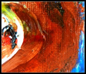
Painting with Burnt Sienna is divine because it deepen the colors it is juxtaposed with, like this detail from my painting, I Thought of Art
How about you? What colors are you drawn to in life and in art? I’d love to hear your thoughts in the comments below.
Have a Wonderful, Colorful Week!


Burnt Sienna is definitely a favorite of mine too – more like a staple. When I first learned portrait painting, I learned to use it to “sketch out” my plan on the canvas with the brush. I really want to visit your studio someday, Dawn!! My family’s having a reunion near Columbus in early August – it would be absolutely dreamy to pay you a visit!
I LOVE your work!!
Wendy, I know some artists that add variations of white to burnt sienna to render their painting before adding color so that they can get their tones correct. I wold love to see you! We will be around in early August so please let me know when and we’ll try to plan a visit. I hope you’re doing well. I’ve loved your books- I need to get part 3. You are an inspiration!
You know my “magical blue wall.” I must have color, too. I prefer blues and greens – calming, inspiring. If I use any yellows, they must be soft – filtered sunlight as opposed to directly staring at the sun. A bright, strong yellow like a sunflower must be carefully used.
Blues and greens look good on you, too. (and red- I’ve always been jealous that you can wear red!):) I love your magical blue wall. I haven’t seen it in a while, though. Methinks I need to schedule another visit down there! Love you, sis!:)